
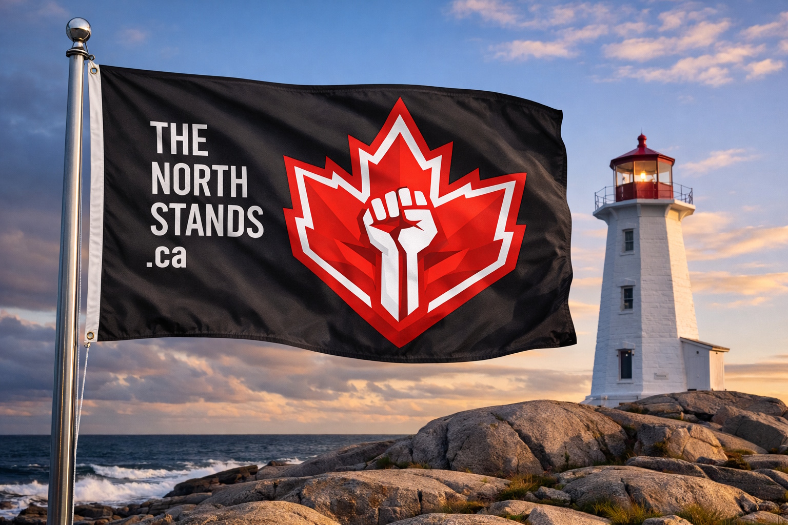
The emblem of The North Stands is not a logo in the commercial sense. It is a mark — a symbol of defense, unity, and unyielding resolve.
At its core is a stylized maple leaf forming a boundary: angular, edged, and deliberate. Within it, a restrained fist emerges in negative space — not raised, not striking, but braced.
This emblem communicates a singular idea: “We do not yield.”
What the Mark of Resolve Represents
- The maple leaf is not decoration. It is the boundary — the land, the people, and the responsibility that comes with both.
- The angular form reflects modern resolve, not nostalgia or myth.
- The fist, formed by absence rather than excess, represents strength revealed under pressure — not aggression asserted outward.
- The containment of red reflects a piece of Canadian identity, and passion without chaos.
The emblem is defensive by design.
How the mark is Used
The emblem may be displayed:
- As a sign of solidarity
- As a mark of shared values
- As a quiet declaration of preparedness and resolve
- As a symbol of unity across difference
It may appear on flags, clothing, personal items, digital spaces, or public art — always with restraint and intention.
The emblem is meant to be recognizable at a distance and meaningful without explanation. It is designed to endure.
How it is Not Used
The emblem is not:
- A call to violence
- A symbol of domination or supremacy
- A partisan weapon
- A tool for intimidation
It must not be altered to include weapons, slogans of hate, or symbols of exclusion.
It must not be used to threaten, provoke, or divide.
To misuse the emblem is to misunderstand it.
Display the Mark of Resolve with Pride!
This emblem is displayed with pride because it represents:
- Collective responsibility
- Disciplined restraint
- Preparedness without panic
- Unity without uniformity
It marks places, people, and moments where pressure does not prevail.
It does not say “look at us.”
It says “we will hold the line.”
